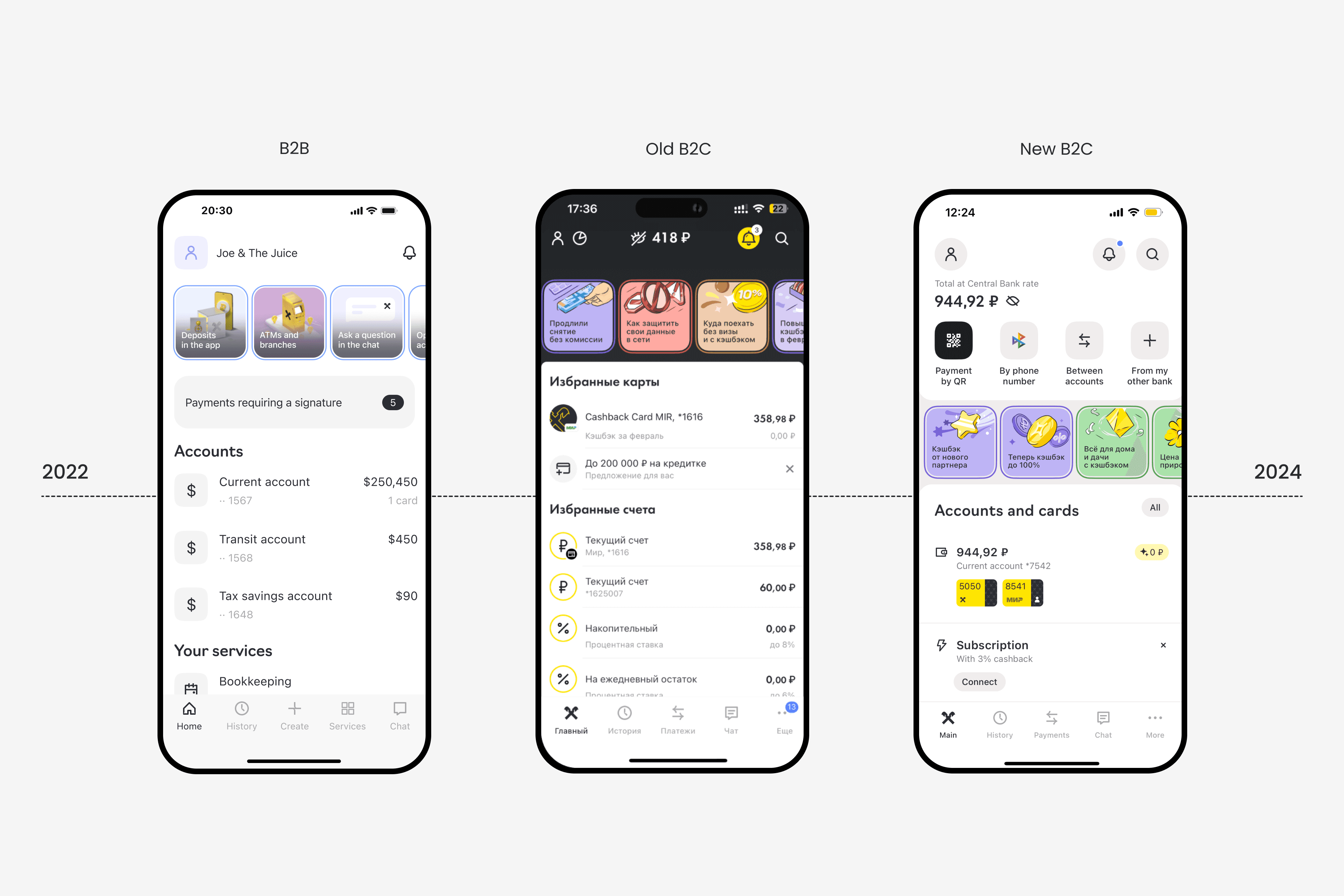
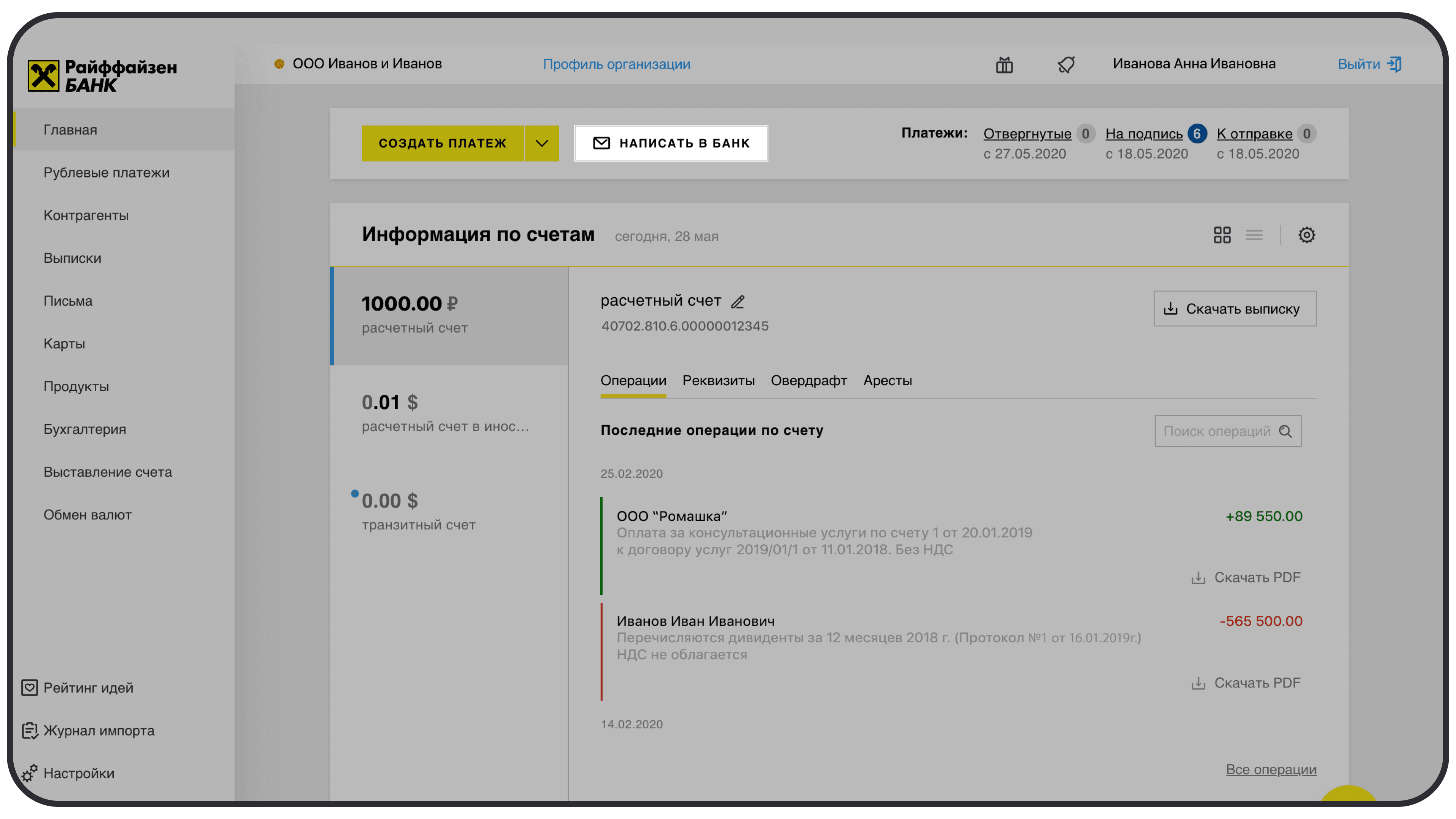
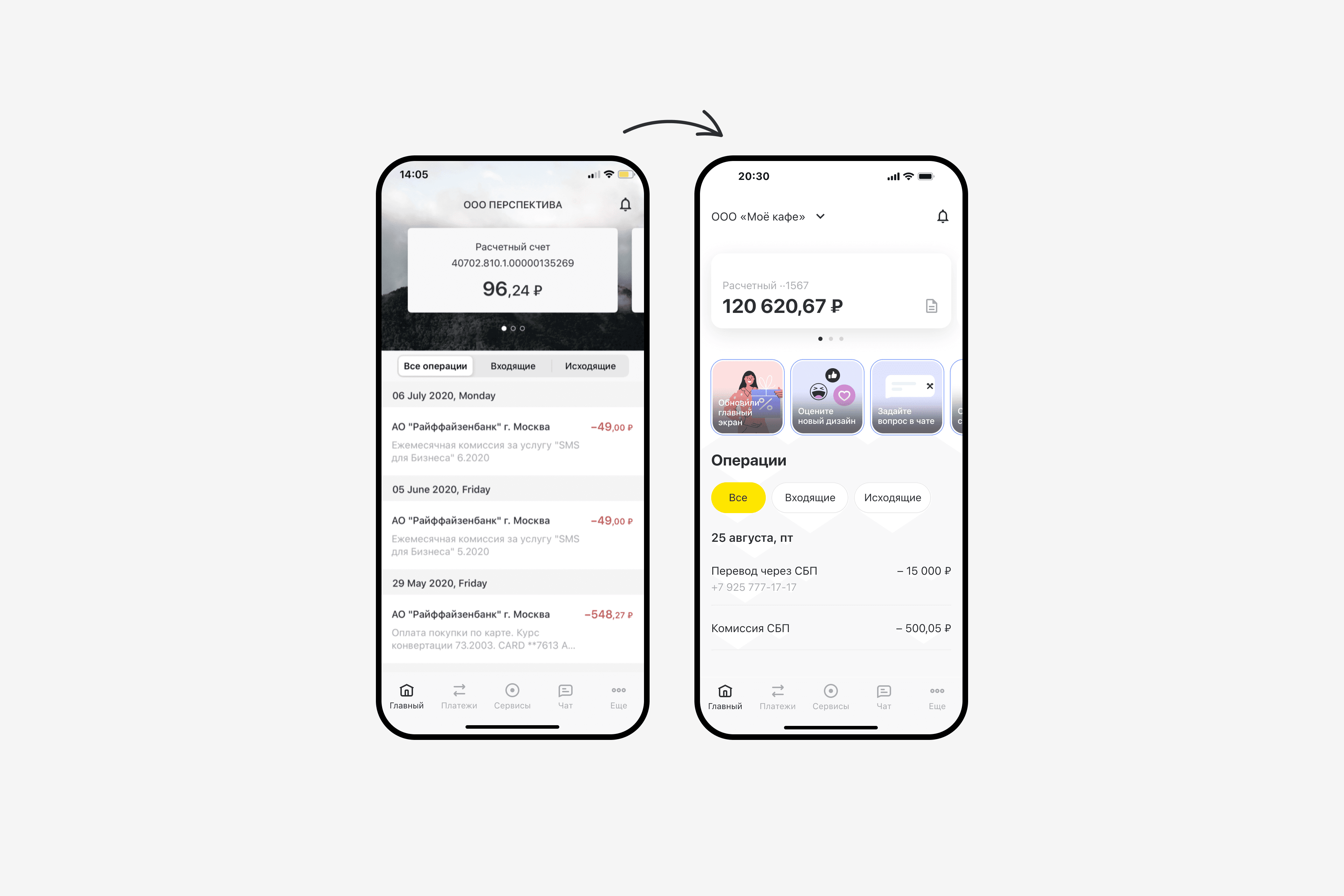
I rebuilt the app architecture and design to scale the B2B user base beyond 200K and move them from web to mobile.
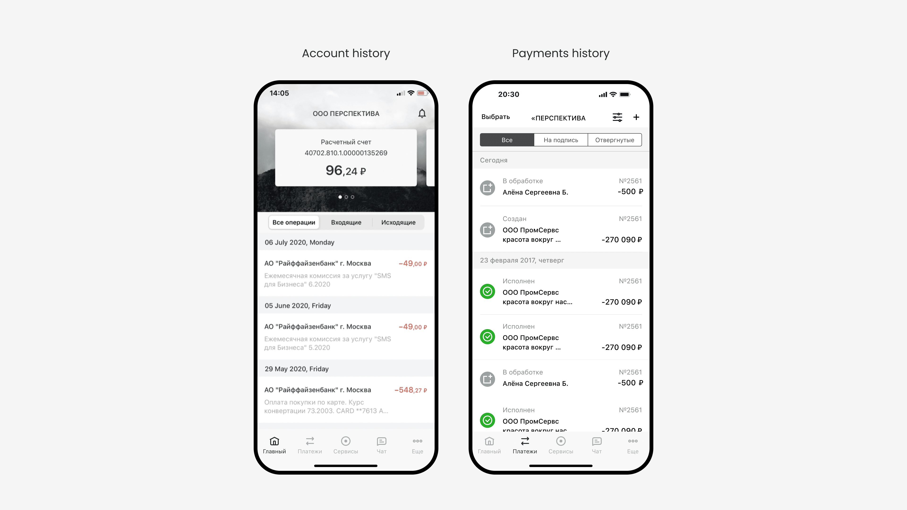
No sorting showed inactive accounts with outdated data first
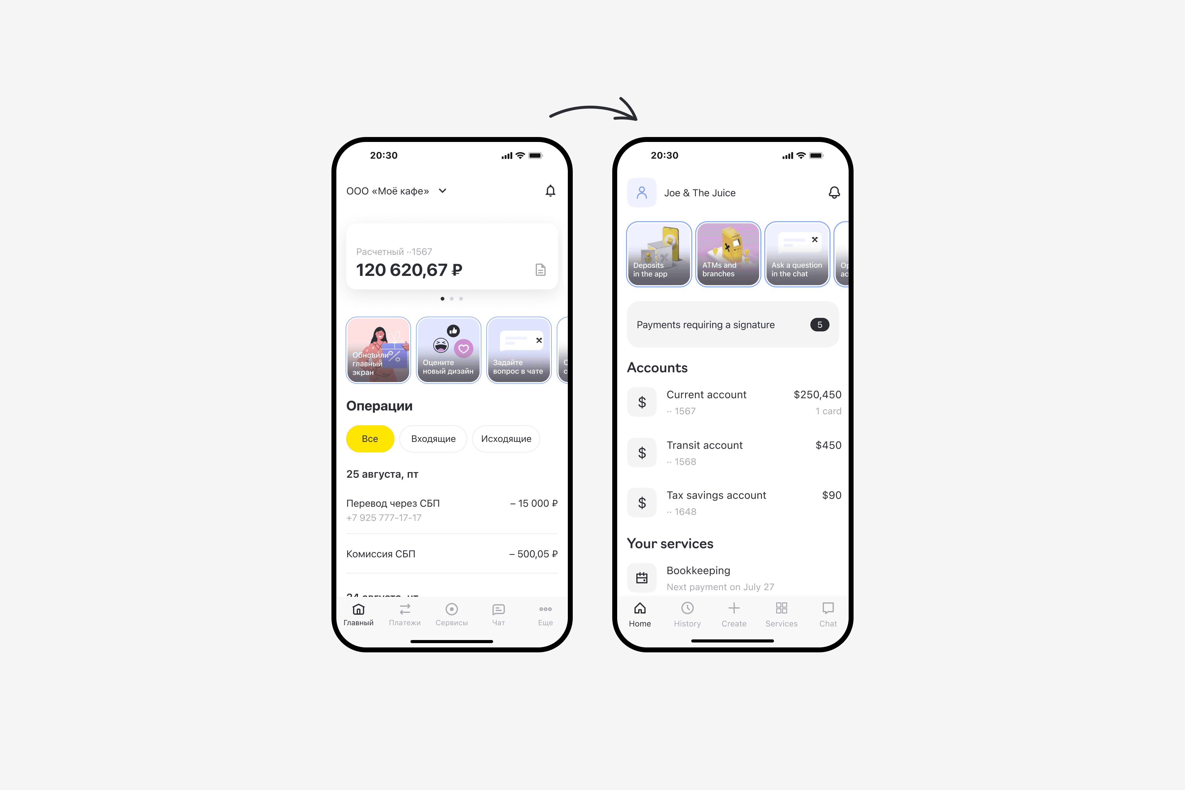
Open deposits weren’t visible in the app, leading to confusion
It wasn’t clear that tapping an account would open its statement


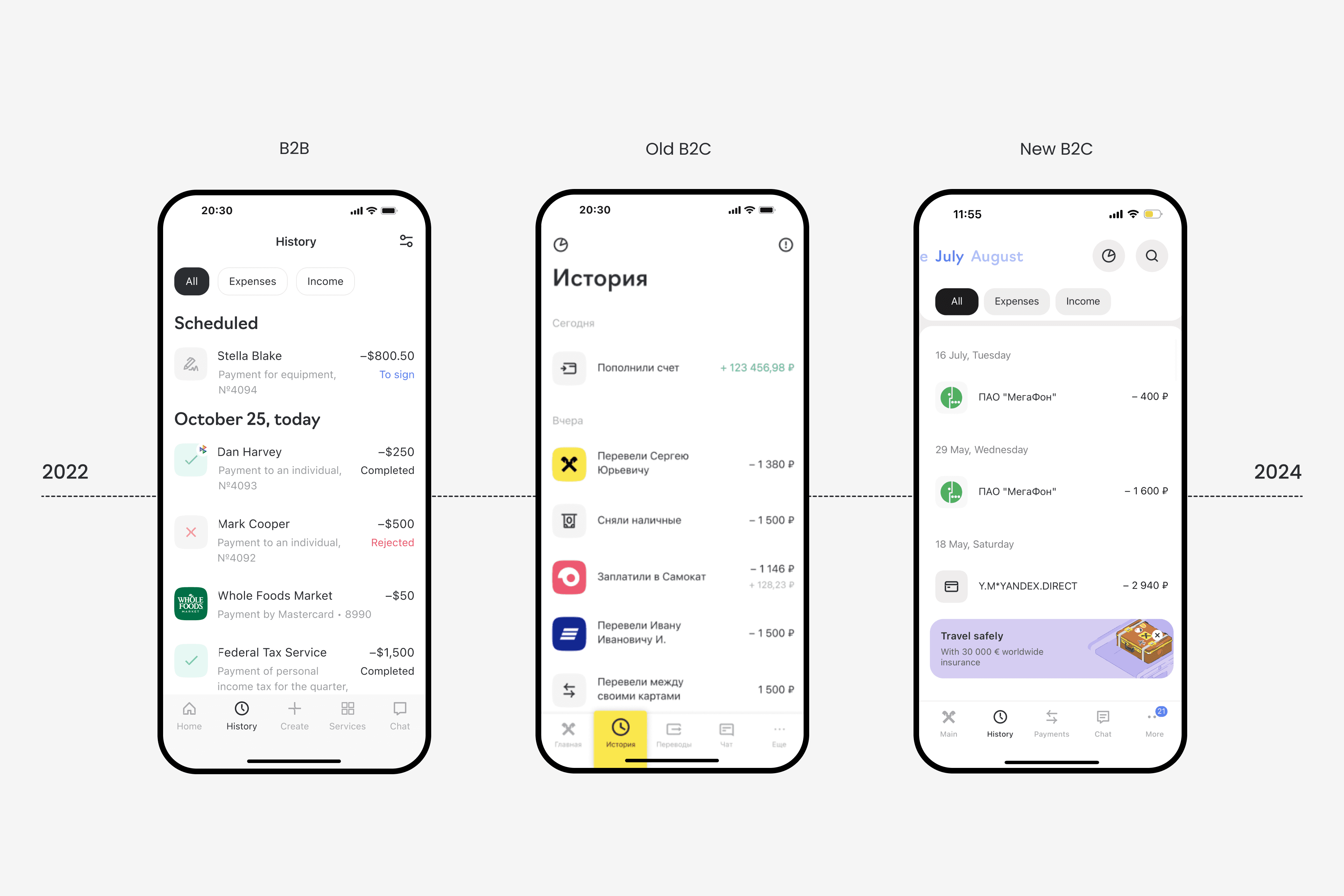
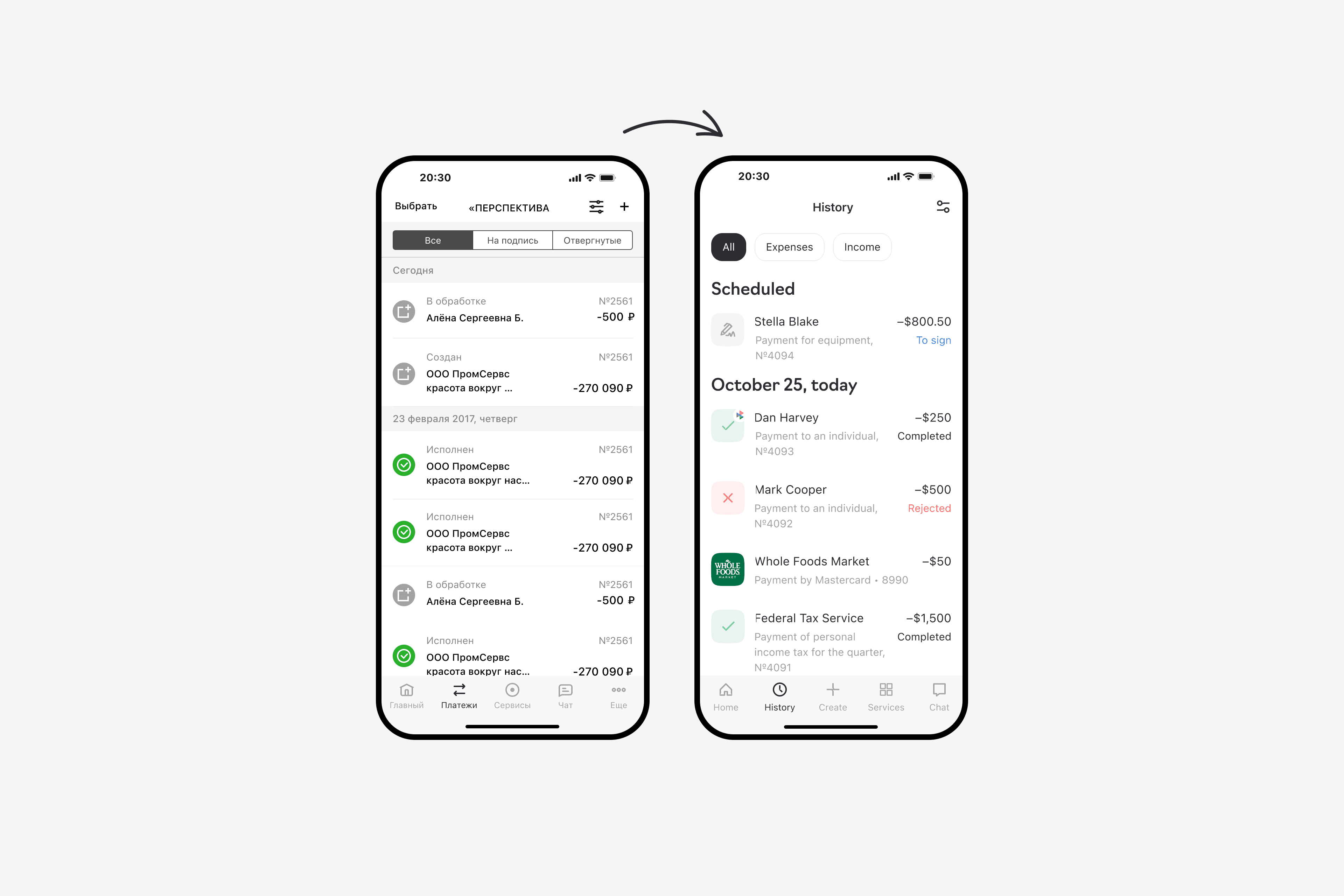
Payments to contractors did not appear in the Account History on the main screen because only card and bank payments were shown. This confused users who expected to see contractor payments in the app just like on the web version.
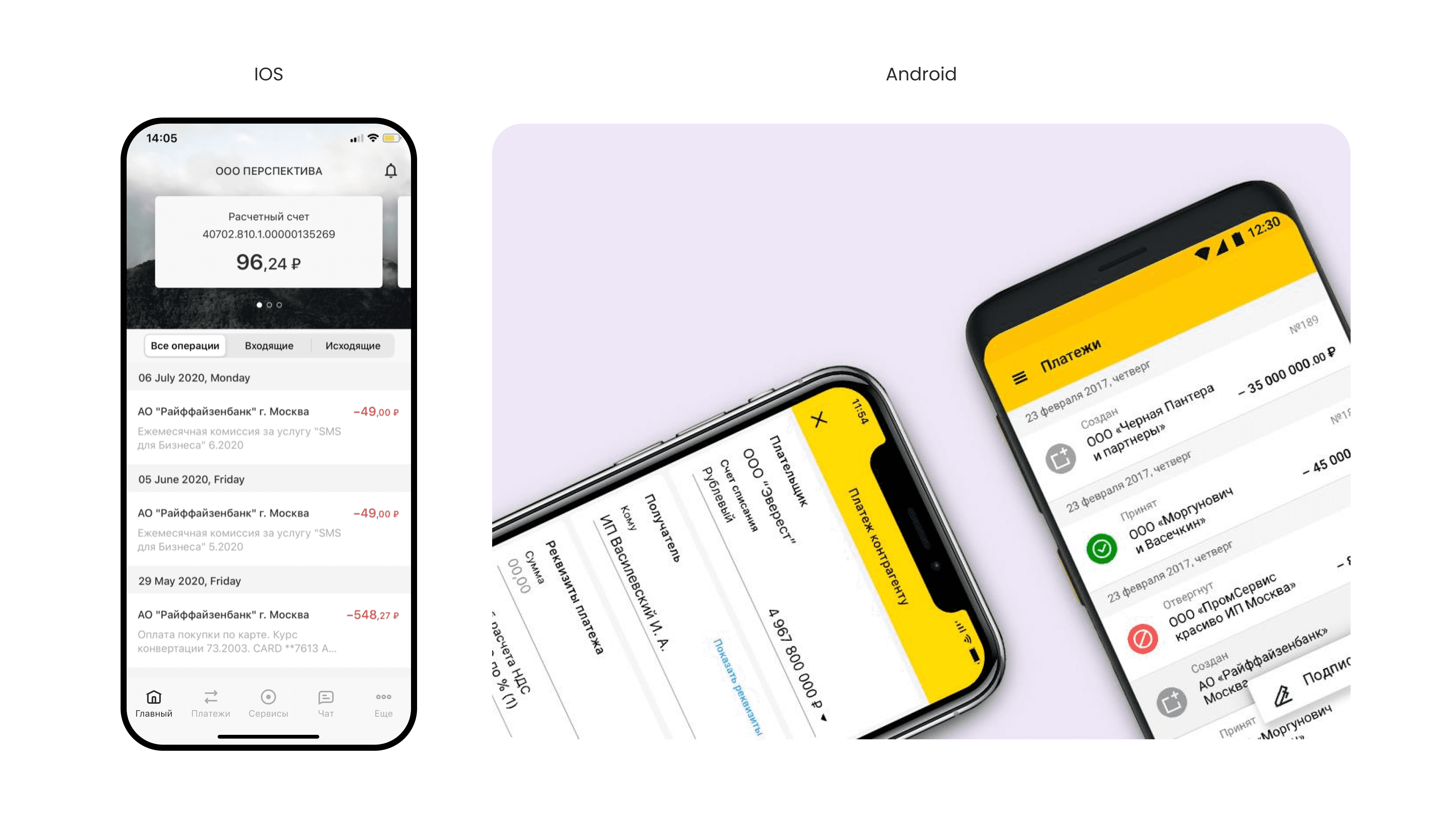
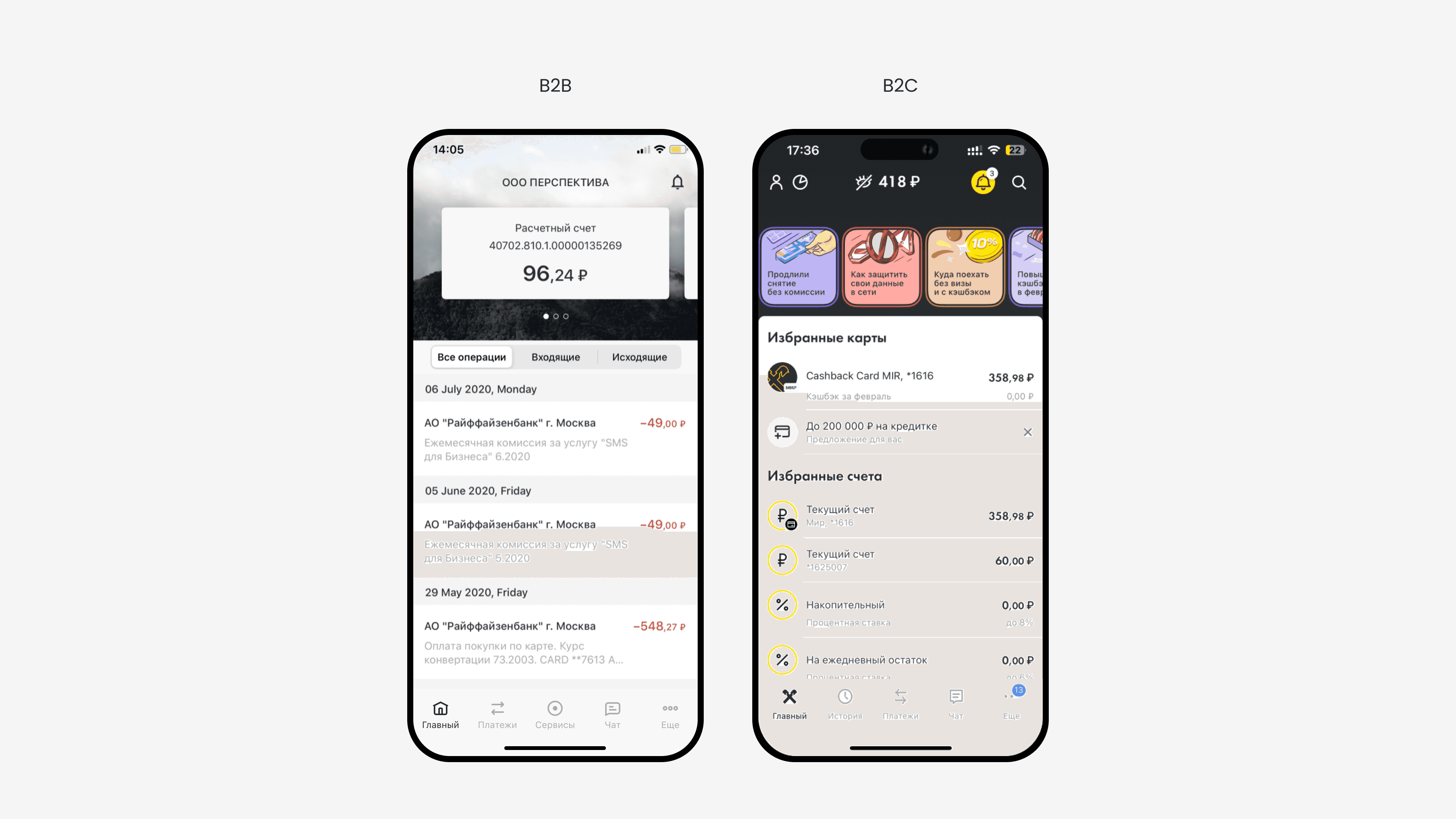
The app had inconsistent designs on iOS and Android and had been outdated since 2018.
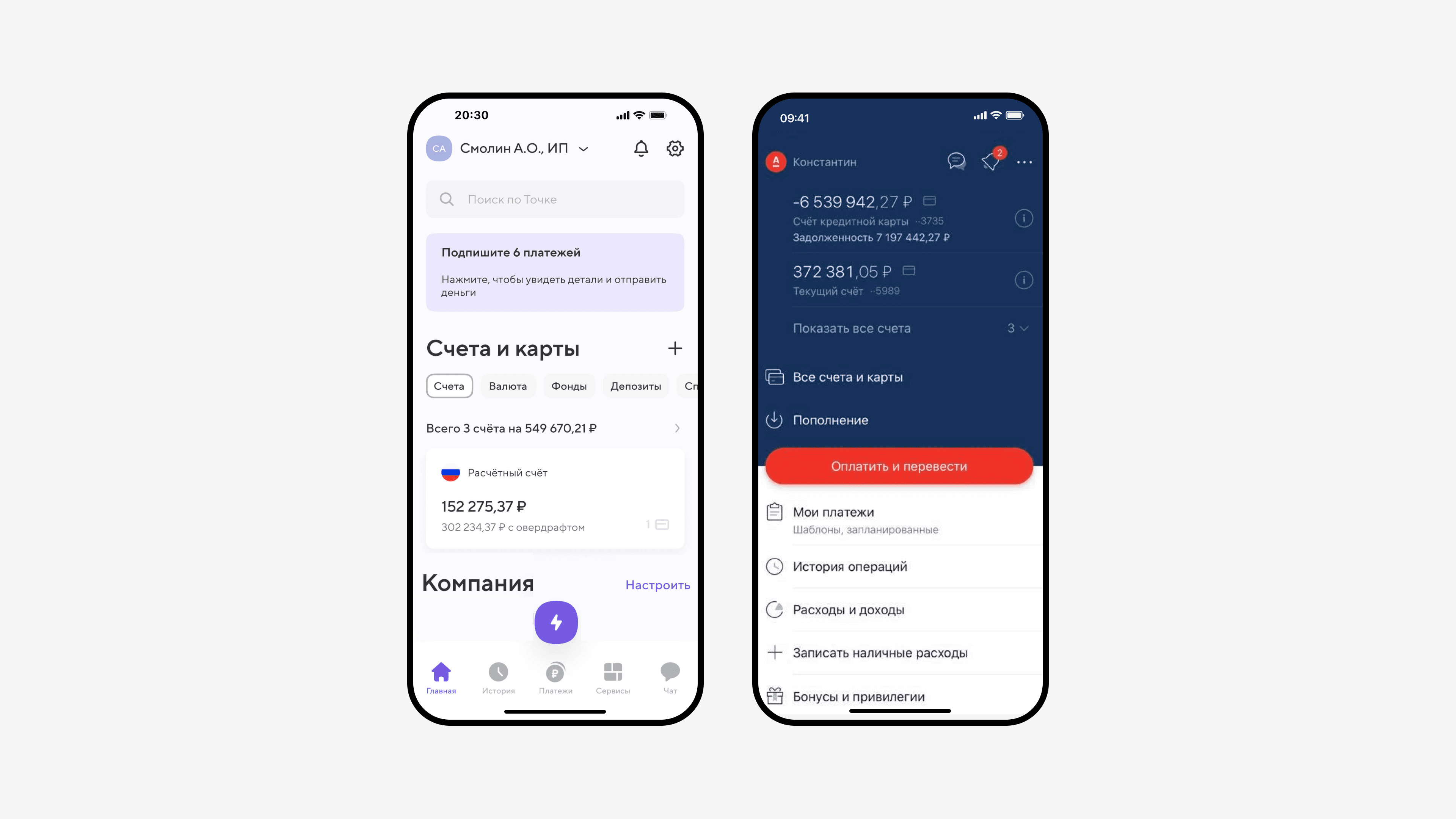
I merged duplicated histories into one History section and removed transactions from the Main screen.
Users started to have a more consistent experience across the app, and in 2024, the B2C app also improved its design, making the apps even more cohesive.